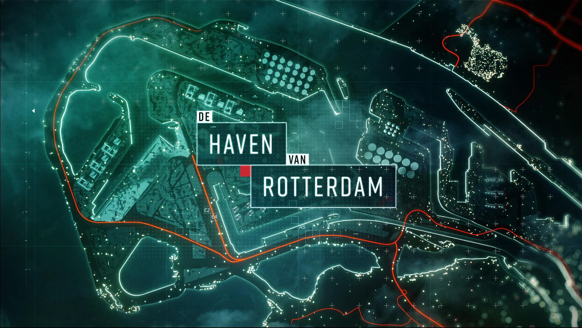
De Haven van Rotterdam
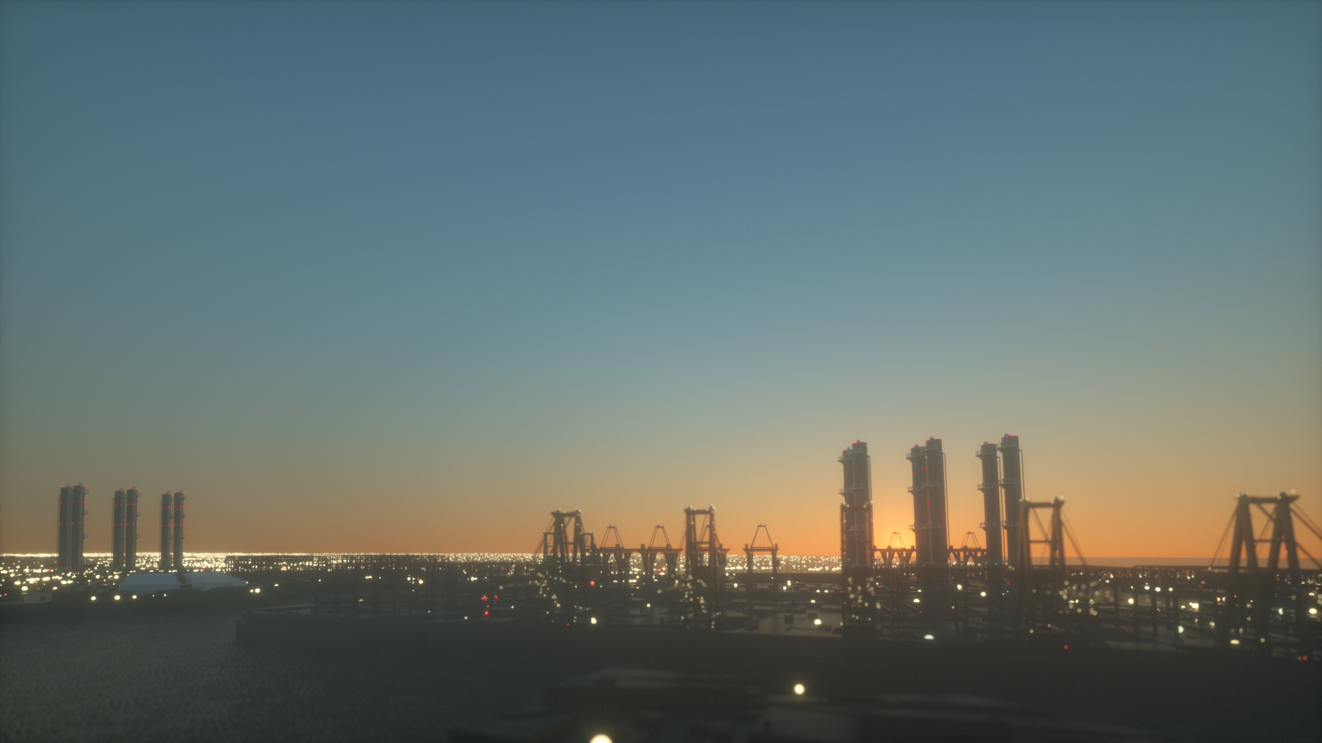
The harbor of Rotterdam is an intricate layout full of paths, machinery, and people. Many skilled workmen play the most important role in the chain of operations, performing hard tasks with clockwork precision, often in adverse weather conditions.
The graphic treatment for the show intended to create a climate for the stories told in that scenario. However, it must be clear enough to effectively explain all the interconnected processes inside this massive complex.
ROLE: Art Direction, Graphic Design, Brand Design, Motion Design
CLIENT: Discovery Channel
Agency: Cape Rock


The logo design was mainly influenced by the shapes of the vertical structures and the container stacks we can find spread across the harbor landscape. The font selected was Rift Soft. This typeface connects nicely with the verticality and geometry of the shapes and also blends properly with the data/HUD graphics.
The arrangement of the forms was inspired by the way the containers are organized in the harbor. The design evolved into more defined shapes regarding the display graphics.

Brand Design


Versatility between the boxes allowed some playful motion design.
LOGO ANIMATION
The proposed atmosphere connotes the severe conditions of outdoor jobs. This is reflected through cold tones, fog layers, and worn-out materials to enforce a tactile feel. The human factor is pictured through multiple small light sources that would bring life and color accents in contrast with the cold canvas.

Art Direction